In this project, I was invited to the UI Designer role. The project’s goal was to rethink and redesign the process of taking a loan. The company has been working on the market for some time and managed to collect some data necessary for work. Therefore, we shouldn’t rely on our own intuition during work 🙂
When I joined the project, part of the UX-related work was already done, including research and the creation of wireframes. Therefore, the main problems were associated with the adjustment of the current style guide of the company for this project. The basic elements have not changed, but it was necessary to give them shape and create a convenient and pleasant atmosphere for the user.
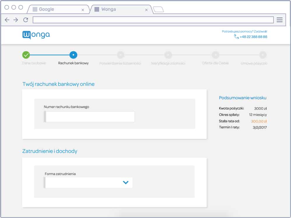
This is how the team’s results looked when I joined
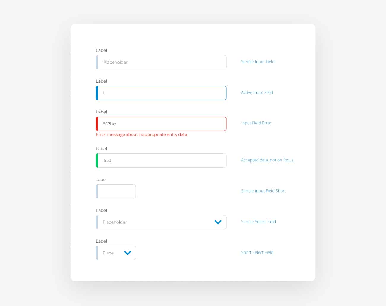
I transferred the design elements from the current style guide of the company to Sketch and put together a new symbol library for the convenient work. Reworked all states. Individually for developers described the necessary details.
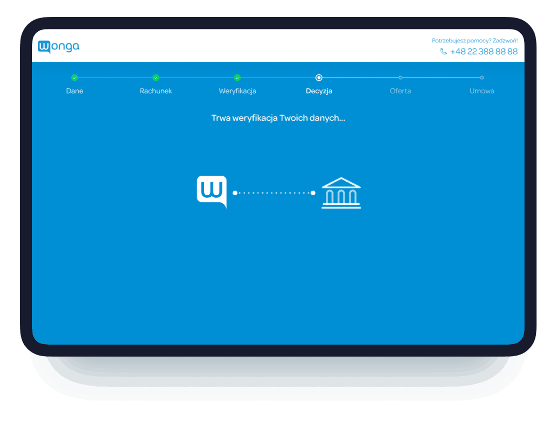
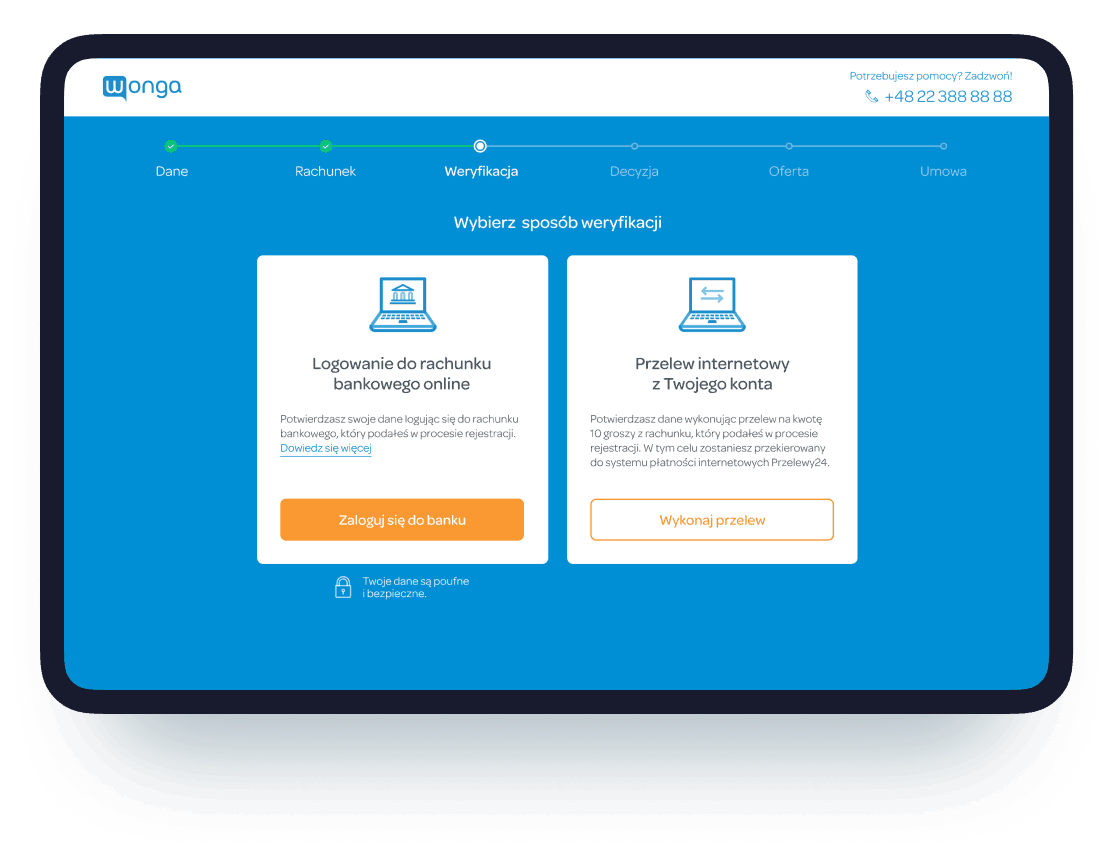
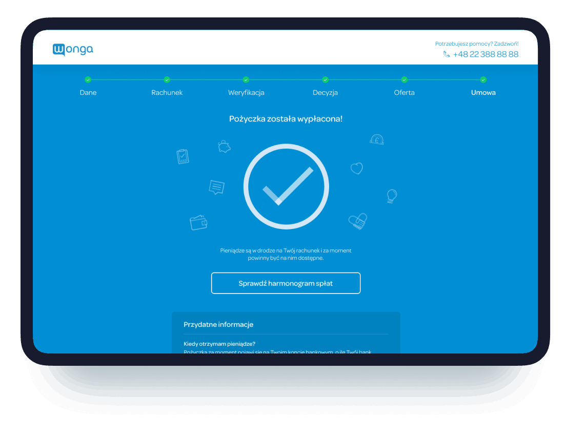
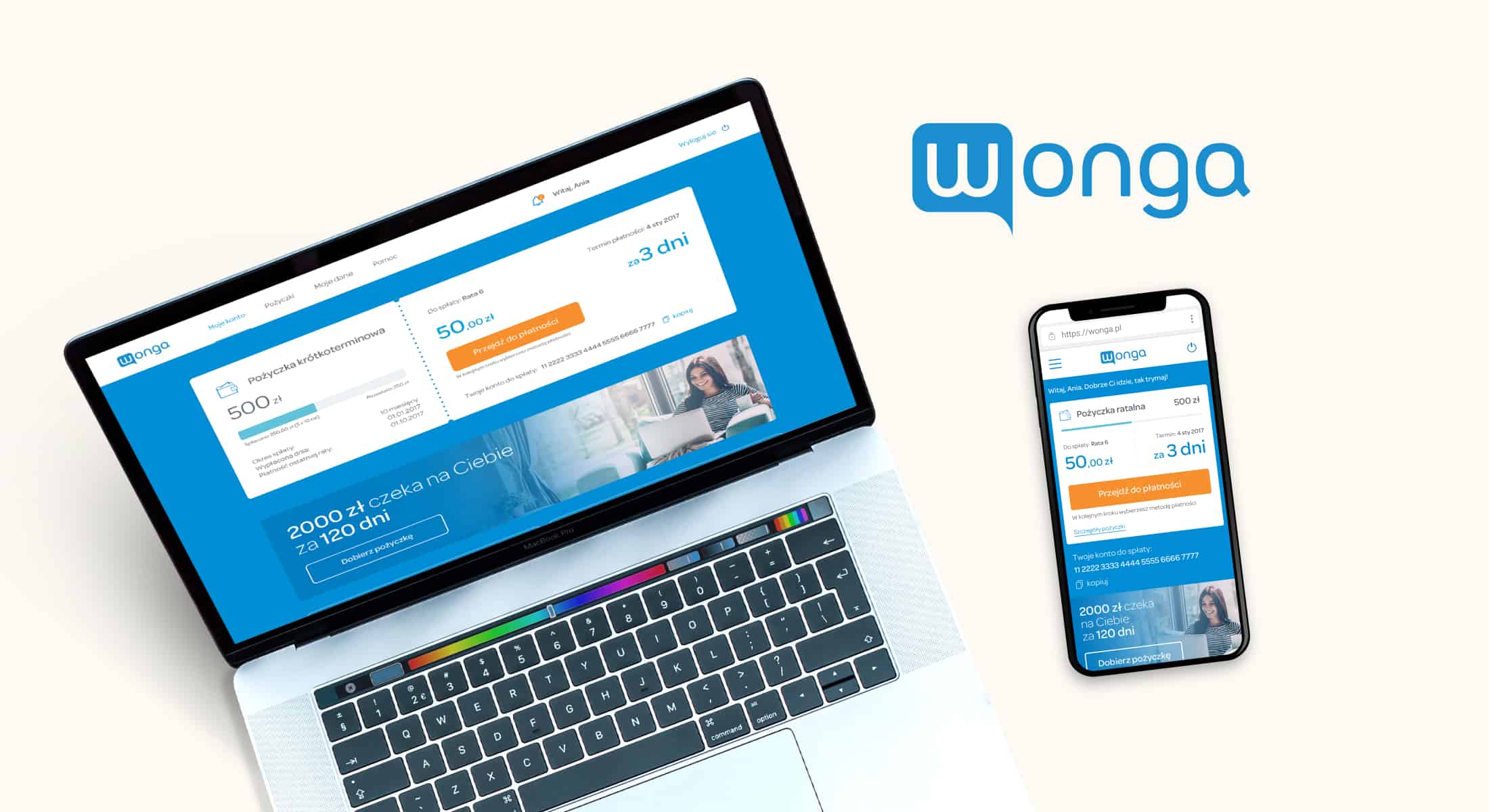
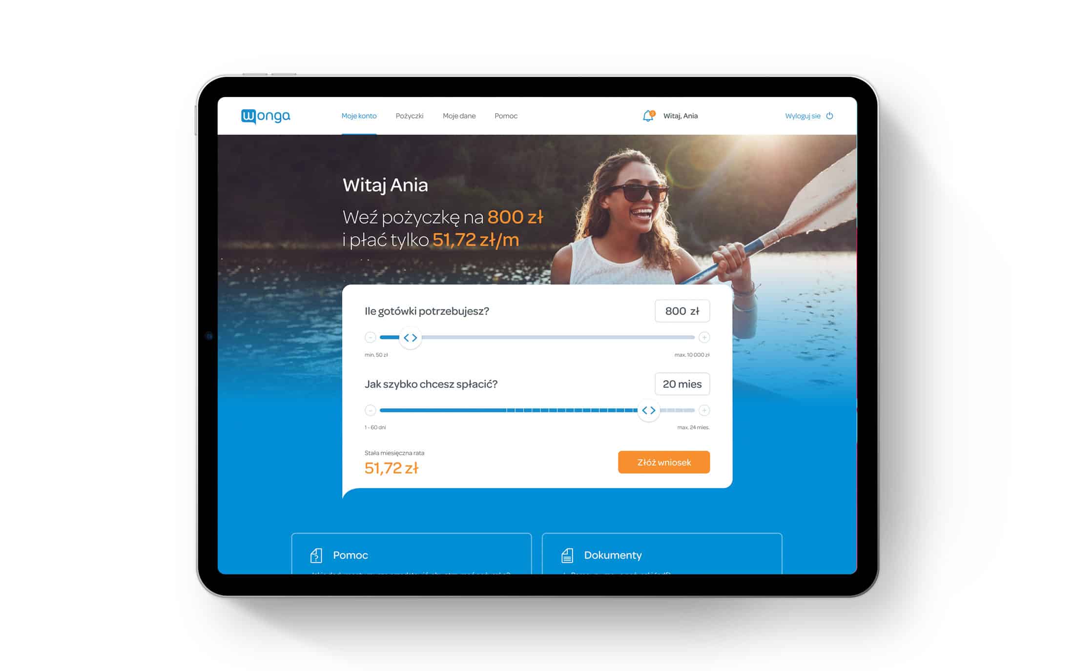
After several approvals and test stages, the main dominant color became blue. The whole color scheme of the project was based on this decision. Most of the secondary elements turned white to concentrate the user on the main flow.
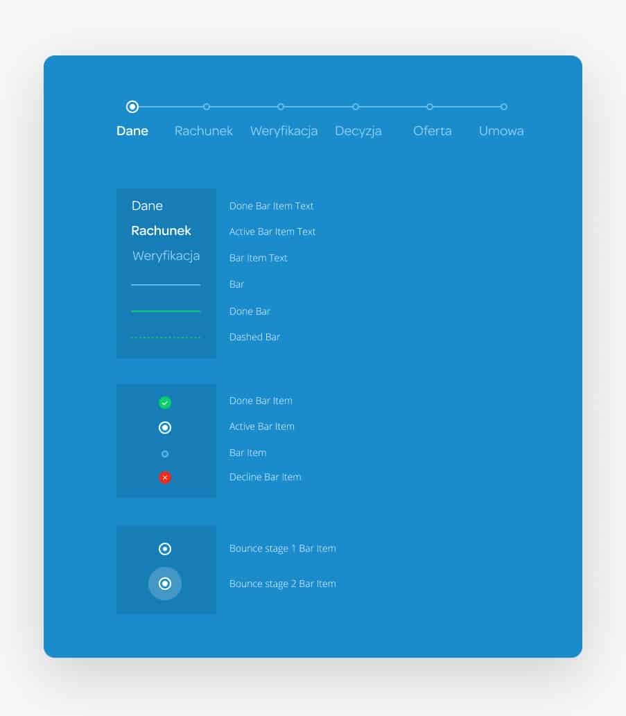

In the process, the user shouldn’t be distracted from the flow which helps to get the desired result. The interface guides and prompts.
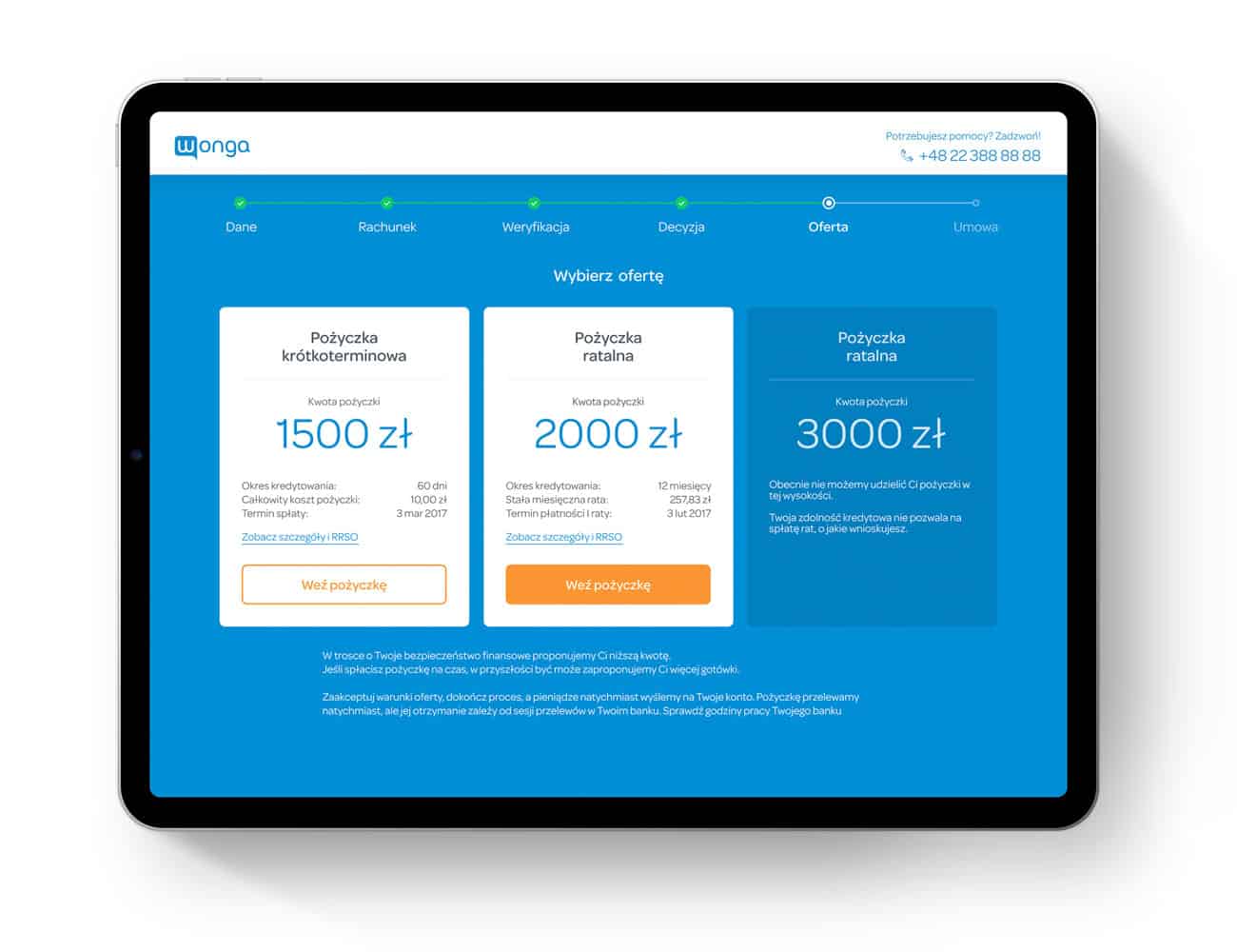
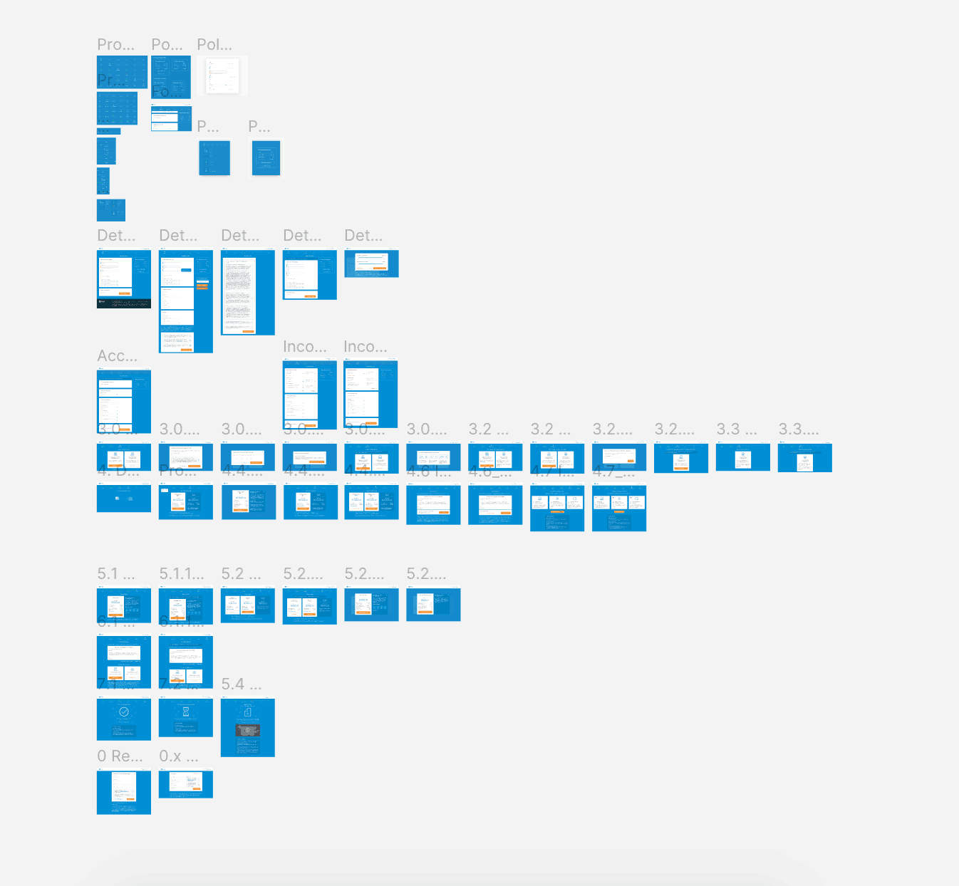
As a result of work, I made 70+ screens. This took several months and a fairly large edits amount. The design is solid. It reflects the general style of the brand, but at the same time, it goes to a new level in terms of clearness and ease of perception. The client was very satisfied with the result.
The main accent was put on desktop screens. But despite this, the mobile version was thought out and made completely.