Inteligo is a banking platform launched in 2009 and since then has never updated its appearance. A critical mass of users was reached and the system needed a redesign. I worked in a team of two and was responsible for the UI.
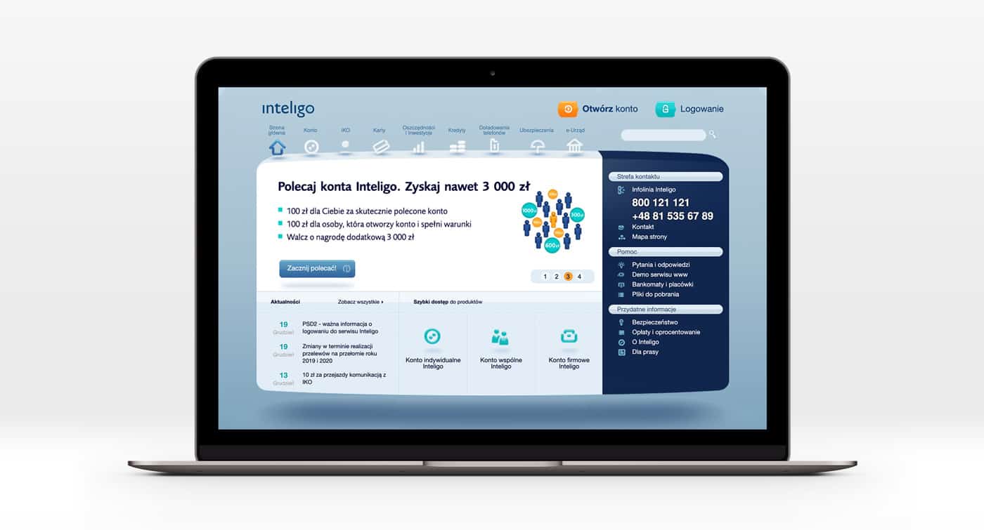
Old design
Our idea was to reduce the amount of information shown to the user and allow him to concentrate on the main thing. And of course, make a new visual style. The new language in which the brand will talk to the user.
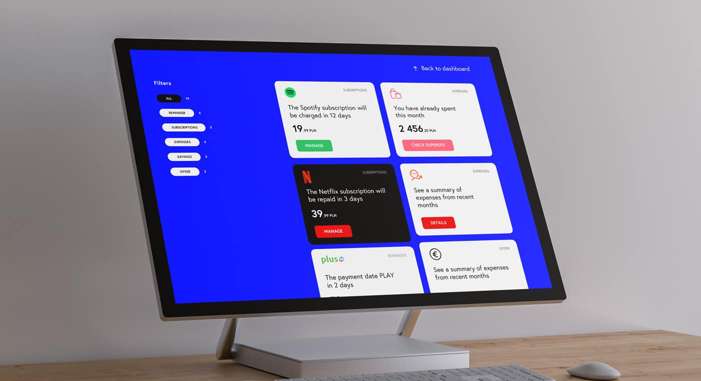
As a basic idea, was decided to divide the structure of the bank into 2 parts. Normal and contextual. Normal with a gray background and contextual with a blue
The mobile version was the priority since the main group of users mainly uses phones to receive banking services. The basic style is the same as in the desktop version. The design has a lot of blue accents.

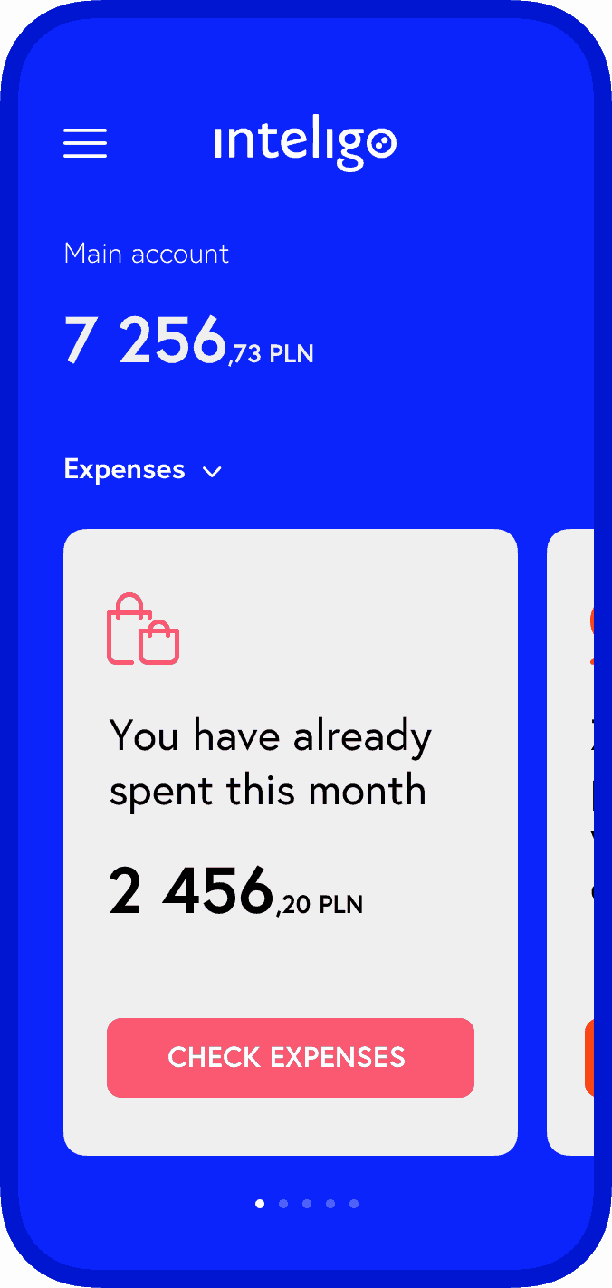
Dashboard
Context tips
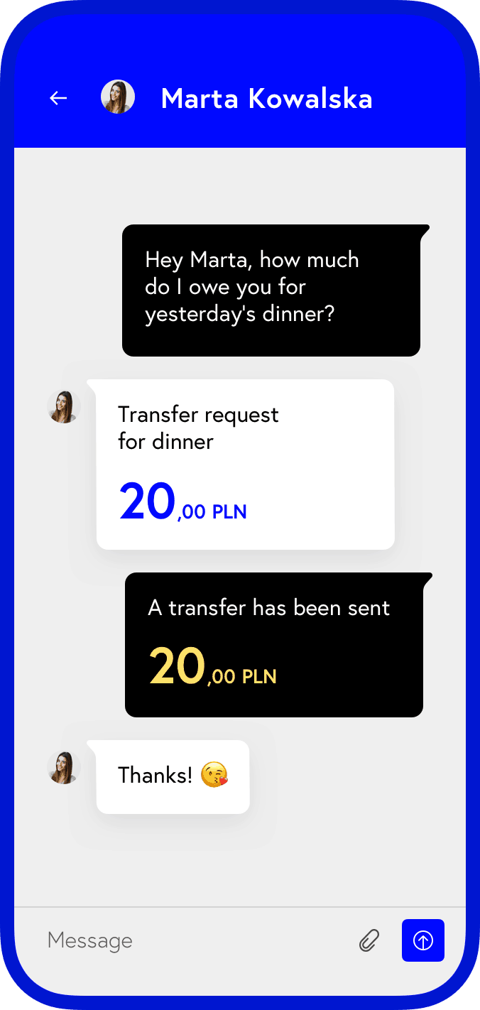
Messages
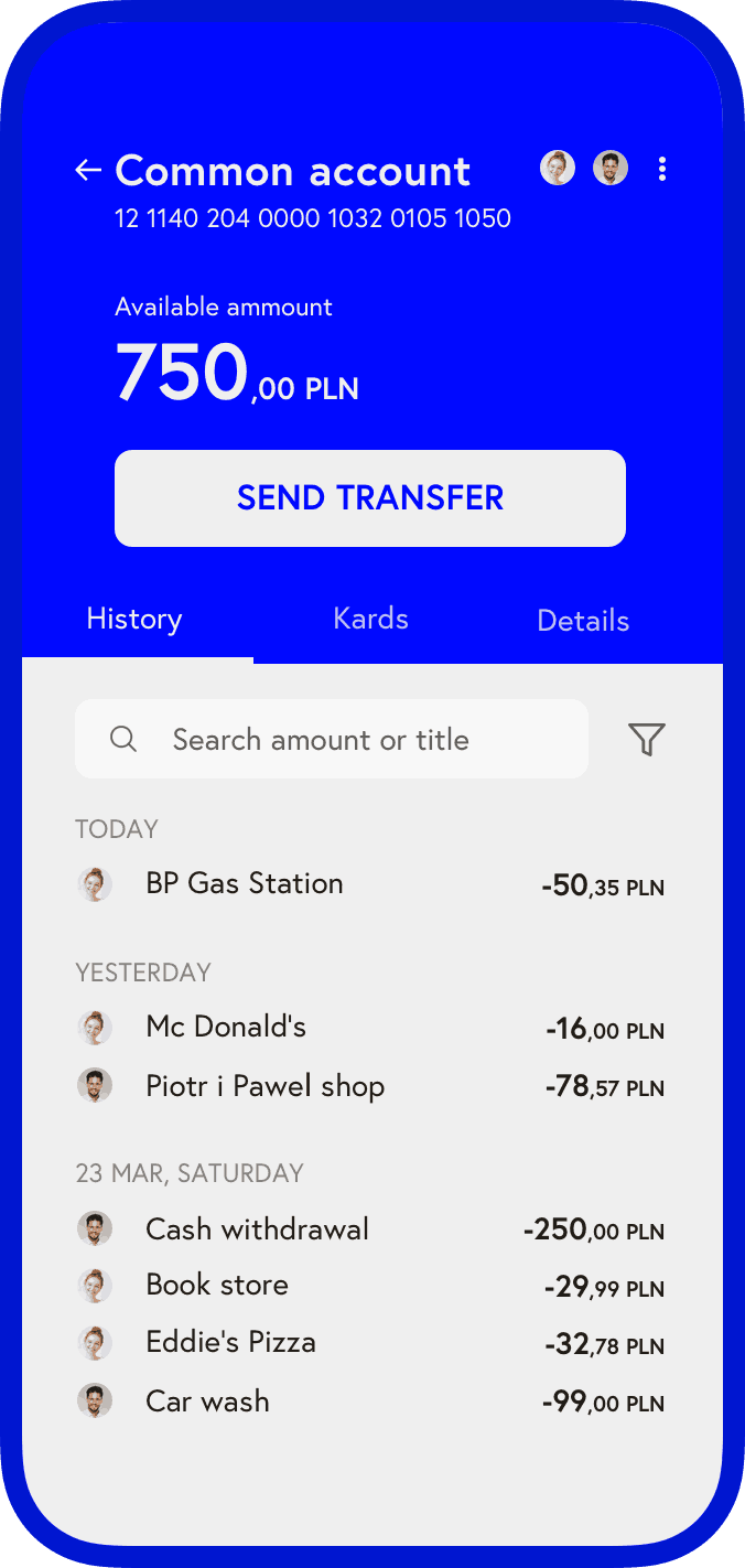
Account

Applying
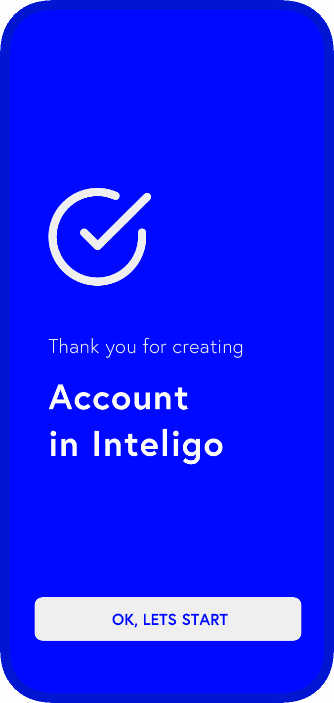
Success screen
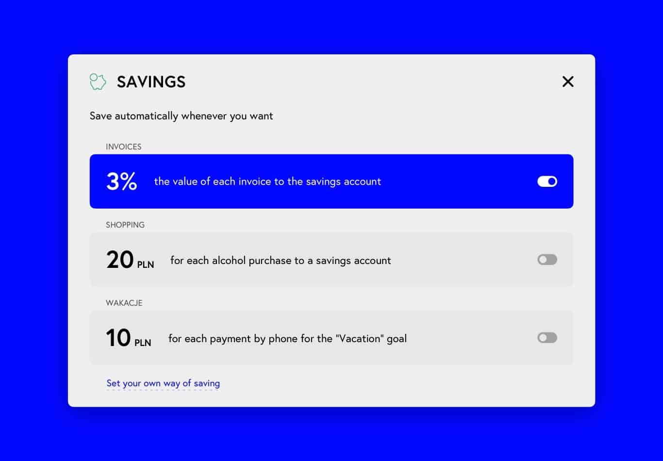
The contextual part of the service is the main hub where the user sees the most important events within the service and can respond to them in 1 – 2 clicks. The user’s needs are deeply analyzed and he receives primarily relevant events.
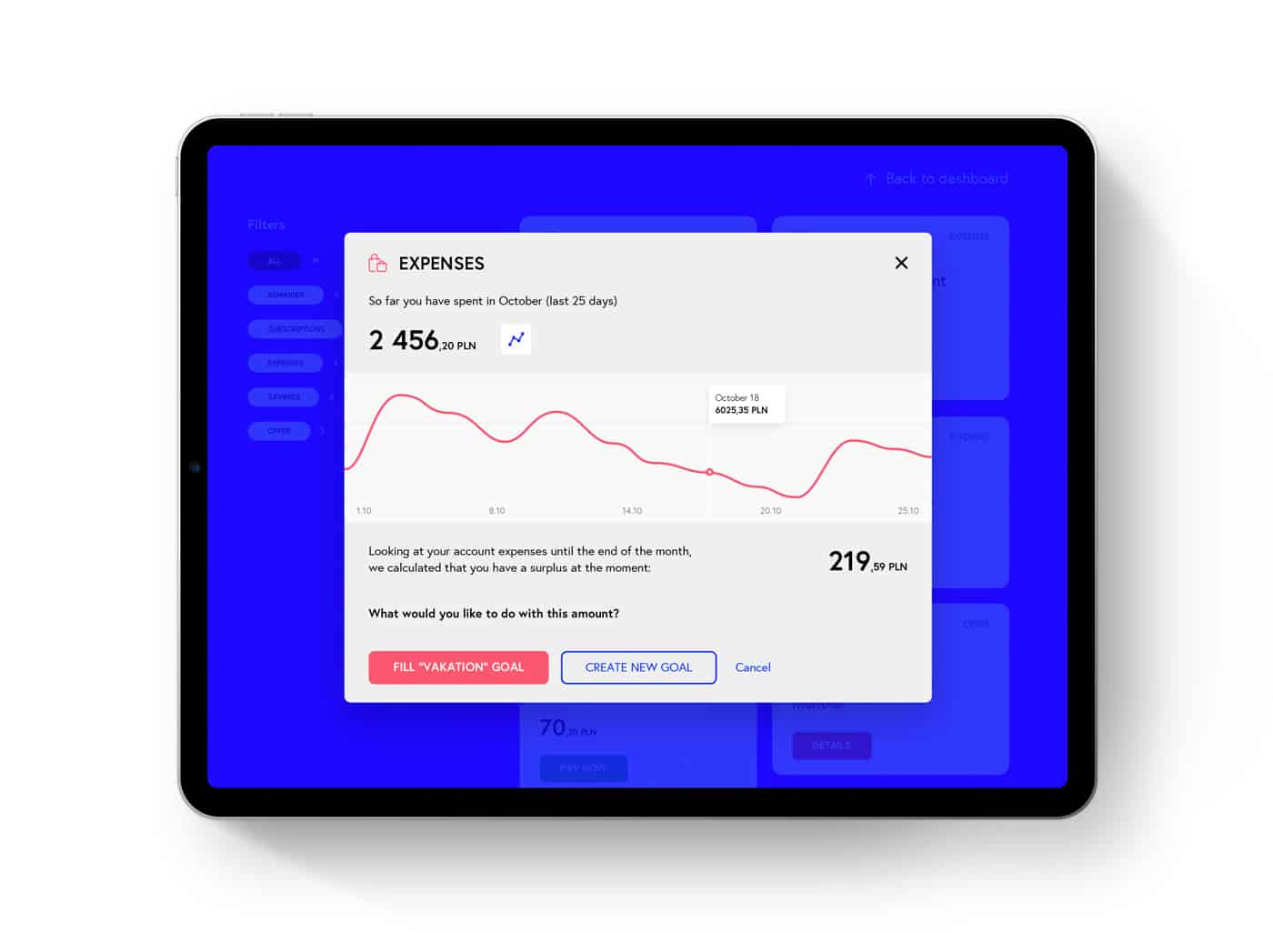
The bad side of contextual cards is that it’s more convenient and faster to open them in popups, not in separate pages. And since putting complex processes inside a popup is bad practice, it was decided to replace complex processes with the simplest ones possible.
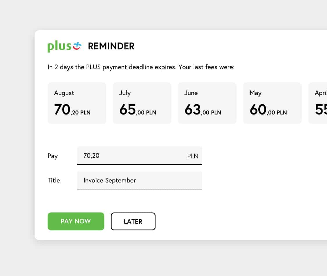
As soon as the user enters a new card, he can get the expected result and useful information in the minimum amount of time. For example, pay an invoice or set up a savings plan.
If the user’s needs go beyond the proposed options, he can always go into deeper settings or scenarios. To set up own way.
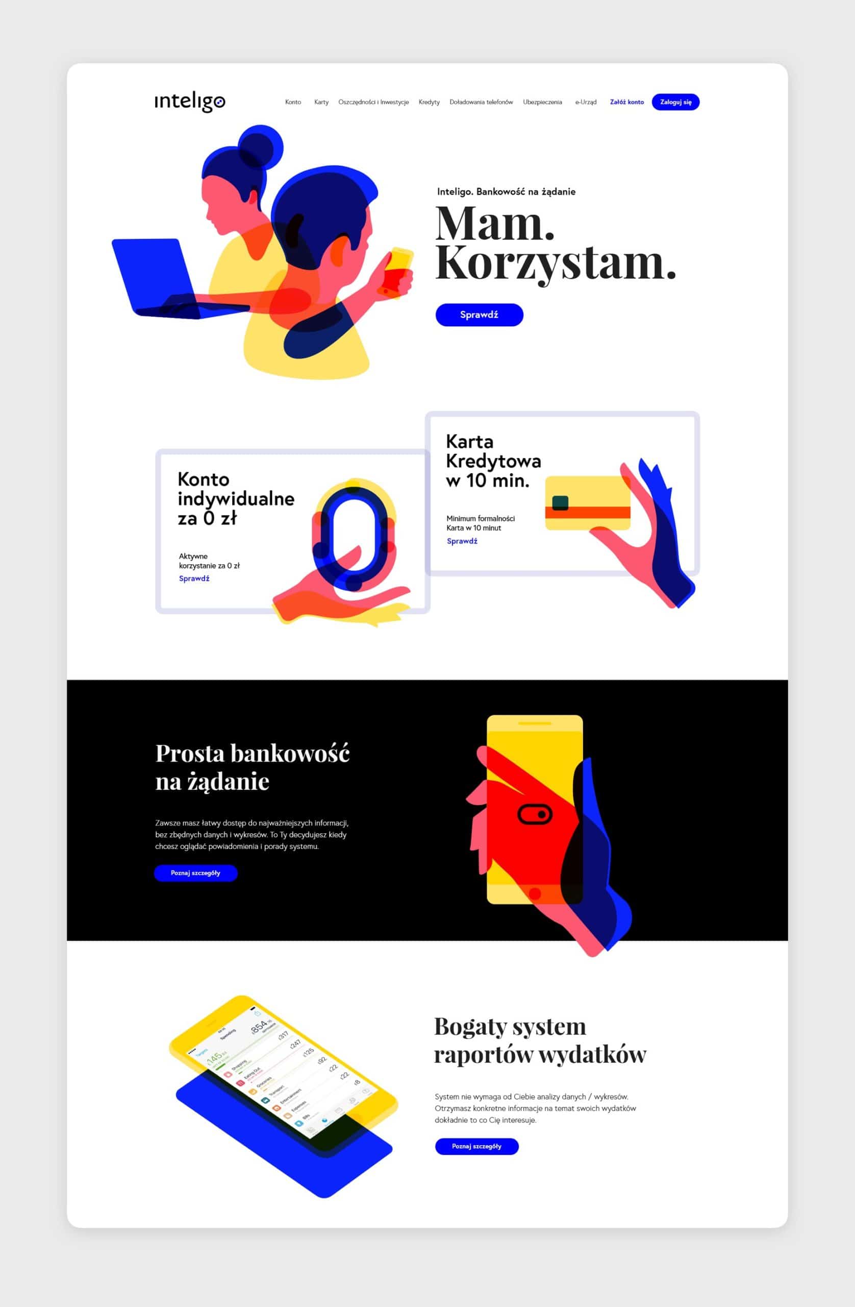
Also in the context of this project, a landing page design was created. A unique identity and style of illustrations should clearly distinguish the product from competitors and create a sense of uniqueness.