Healthcare assistant
in Canada 🇨🇦
Healthcare system isn’t easy. It’s kind of a quiz. And Doctr know’s how to solve it.
Product Design • Web application

01
About project
The
Problem
To understand the situation, we are going to talk about health. The Canadian healthcare system provides free or almost free health care to all Canadian citizens. Free access generates huge demand.
People face problems in registering for appointments:
- overbooked doctor’s calendars;
- lack of unified booking instrument;
- not understanding what to do when all slots are taken;
The
Solution
Doctr is a mobile app and web-based booking platform that provides patients with the ability to easily register and manage appointments. It is also the only tool to find the actual wait time in every Emergency Room in Canada.
My
Role
I led the Product Design - User Experience (UX) and User Interface (UI) - of this project.
Design
Toolkit


02
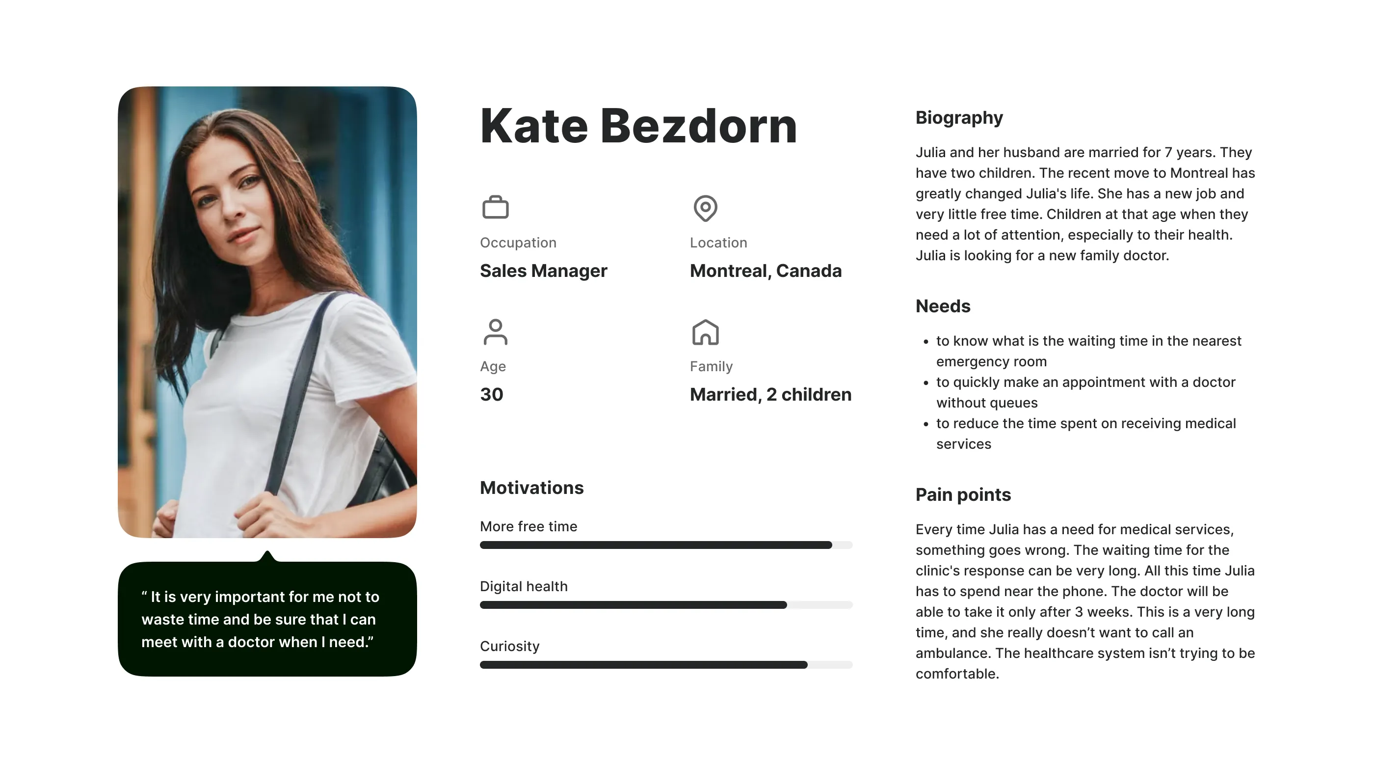
User persona
Collecting data from analytics and from the client, we created an average profile of our user. To represent our core users, their needs, frustrations and goals. This information will be contextual to the intended user and relevant to the value proposition.
03
Initial concept
From the very beginning of the project, the guys from the team wanted to test how I feel their application and how I could refresh the visual side of their product. Later, this concept became the starting point for the design system creation.
04
User flows
The user flows were created out of the need to understand how users interact with the product. We were able to identify dead ends and fix them.
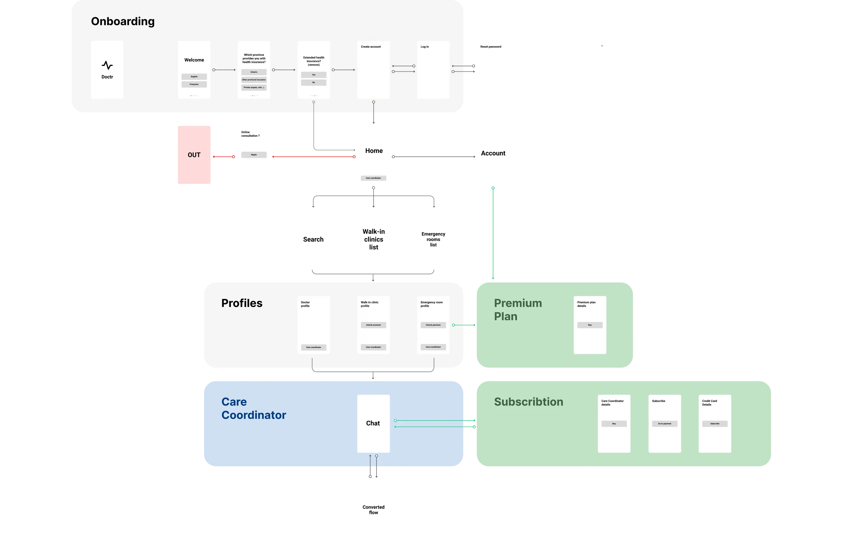
05
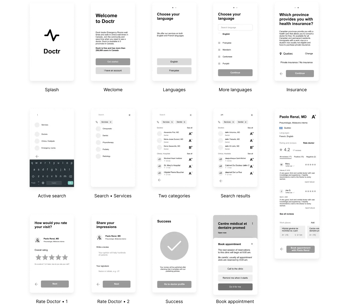
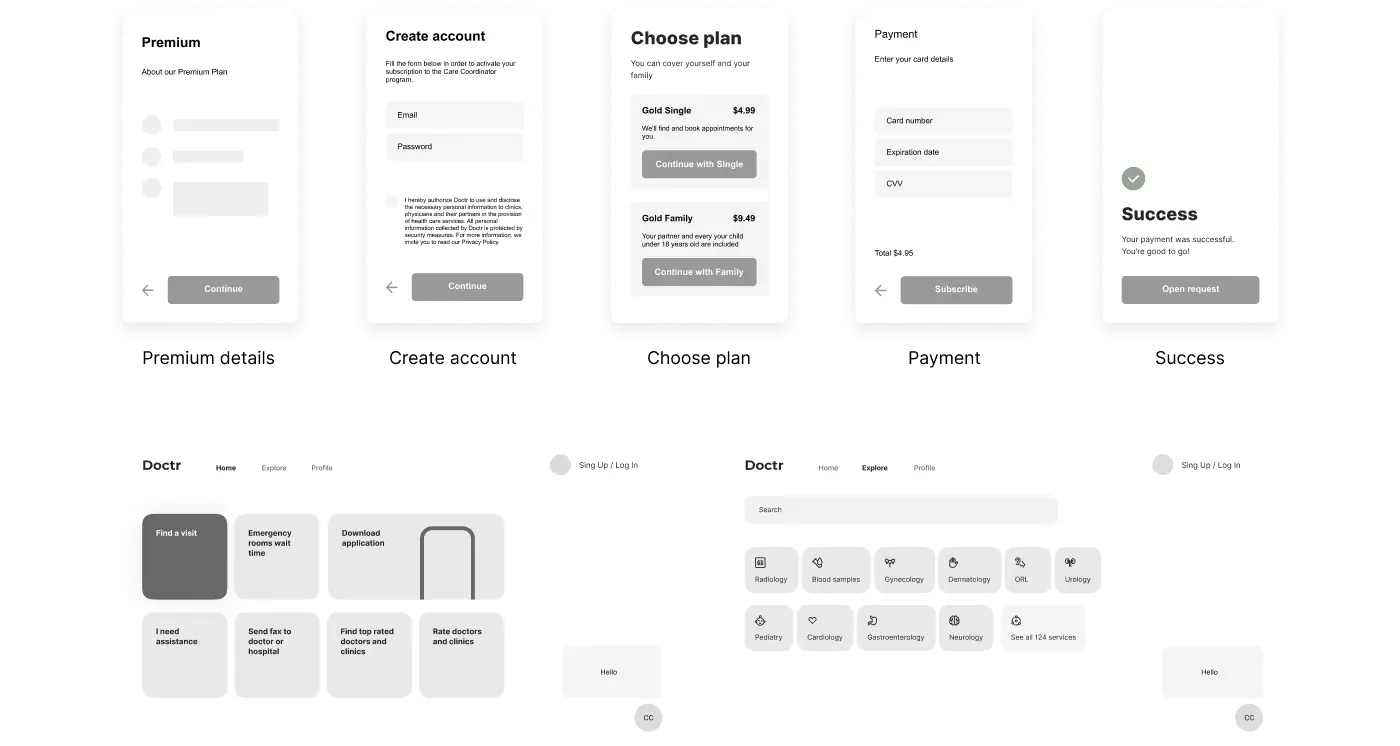
Wireframes
Wireframes have been developed to build the structure and architecture of information. At this stage, we polished the details of the content and designed transitions logic.
06
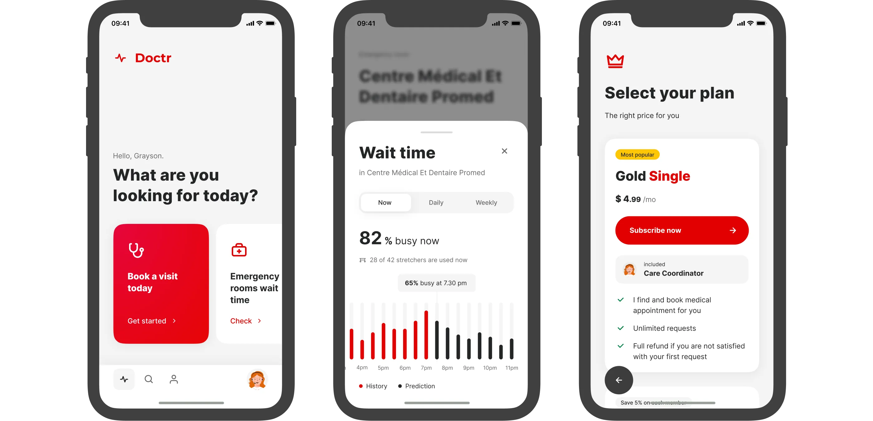
User Interface
The visual side of the product is the key to the user. I took an approach with strong typography and bright contrasts.
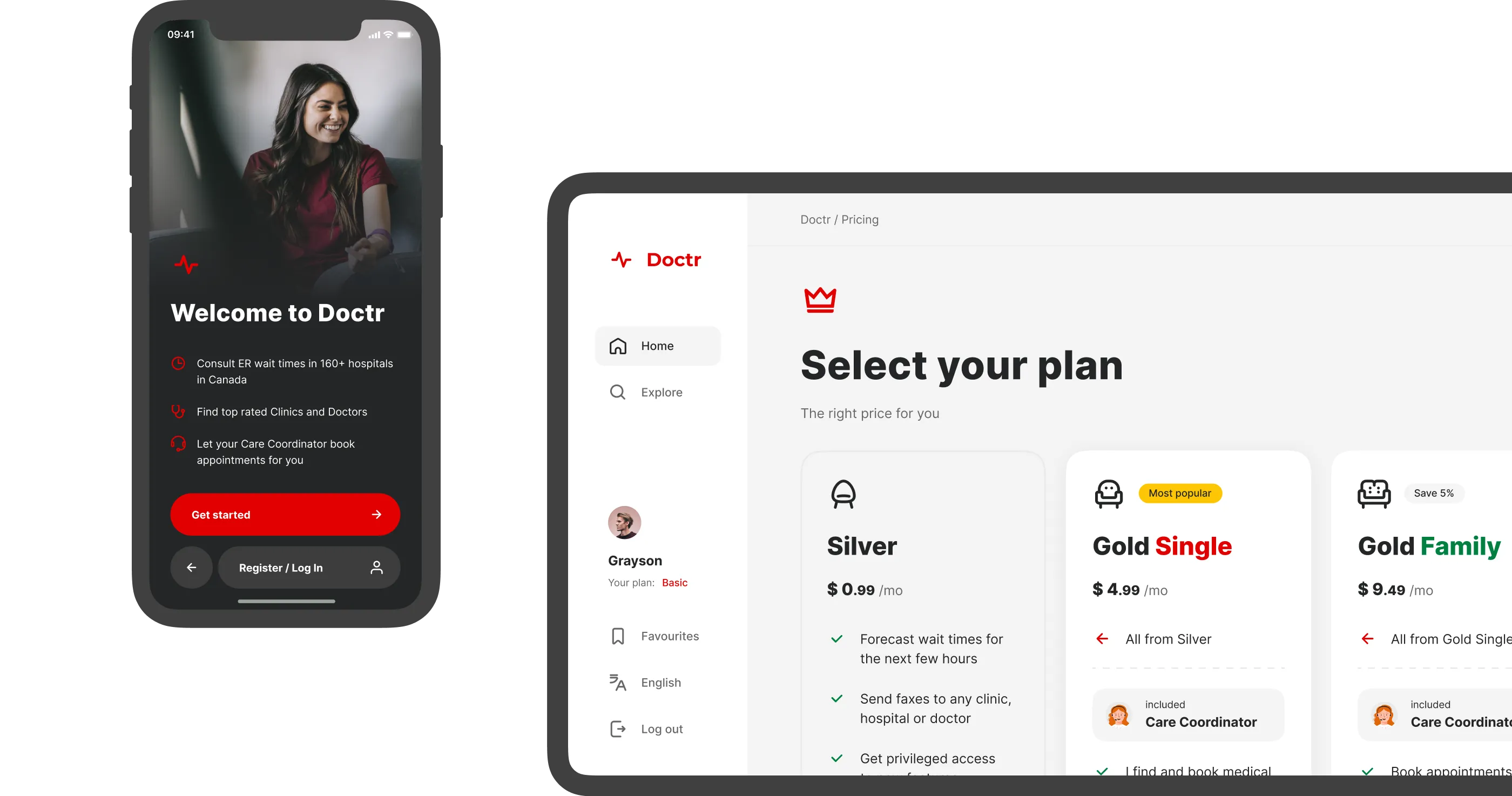
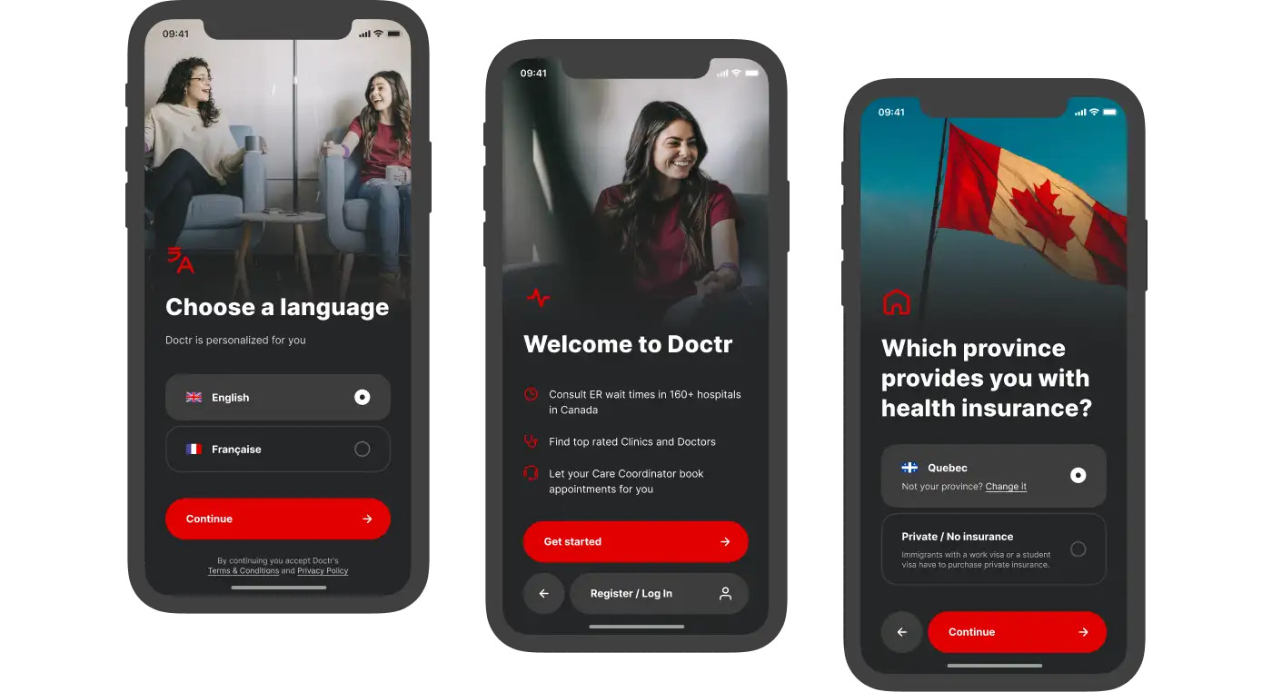
Onboarding
Doctor helps solving real-life problems of people with very different inputs. Therefore, upon first use, we invite the user to set up their experience. For example, interface language, insurance data. The main color scheme of the onboarding is made in black to create feeling of different context.
Login &
Registration
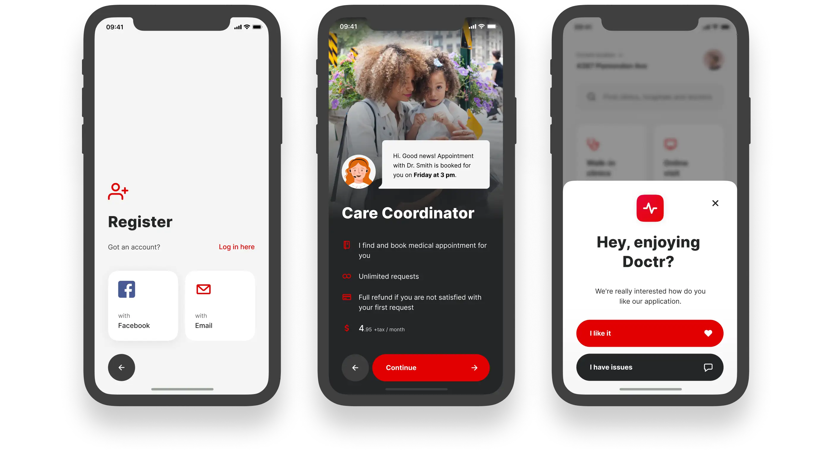
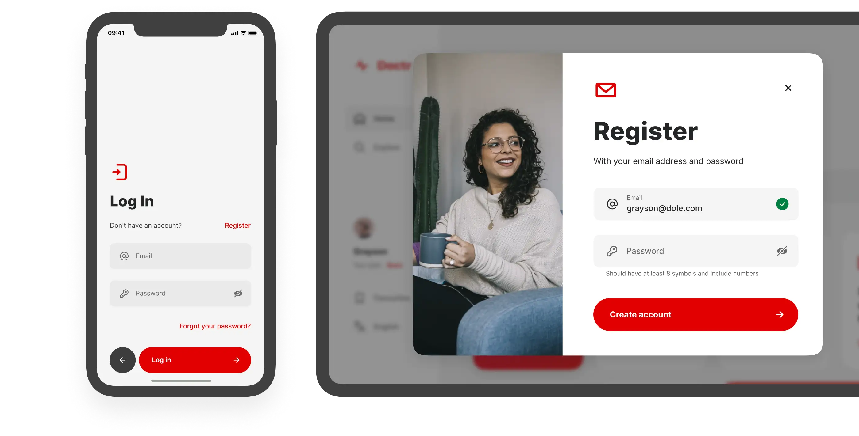
Use of Doctr assumes that we will store the user’s personal data, including insurance data. Therefore, a crisp login and registration are a must.

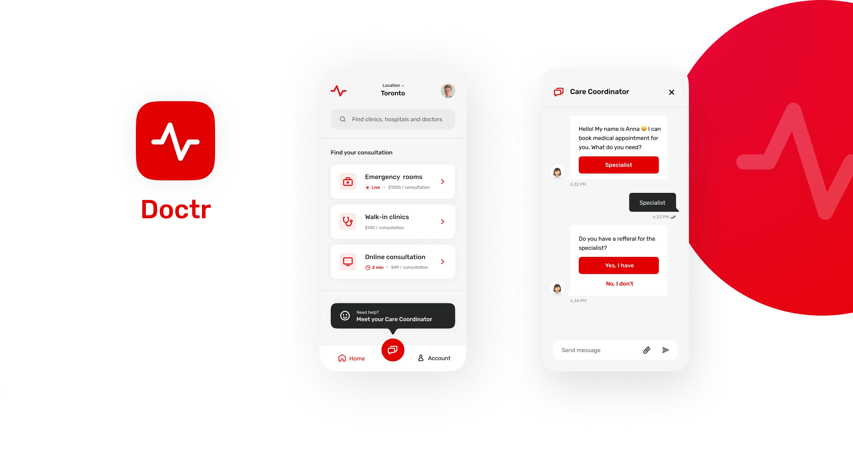
Home page
After onboarding, the user gets to the home page. It contains cards with most popular actions
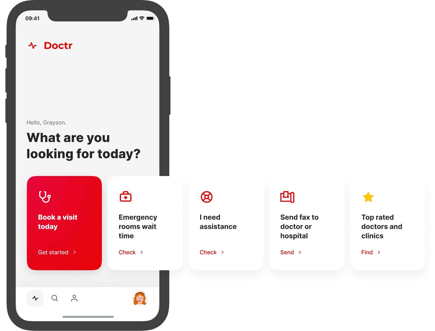
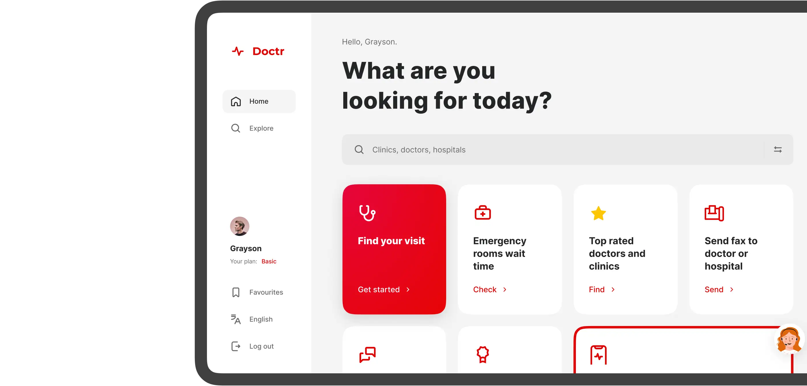
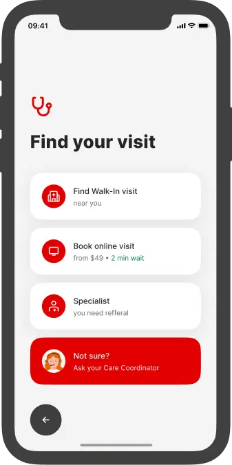

Find a visit instantly
This page is the main hub of the app. This is where most user journeys begin. The idea is that from one place we can offer the maximum number of solutions.

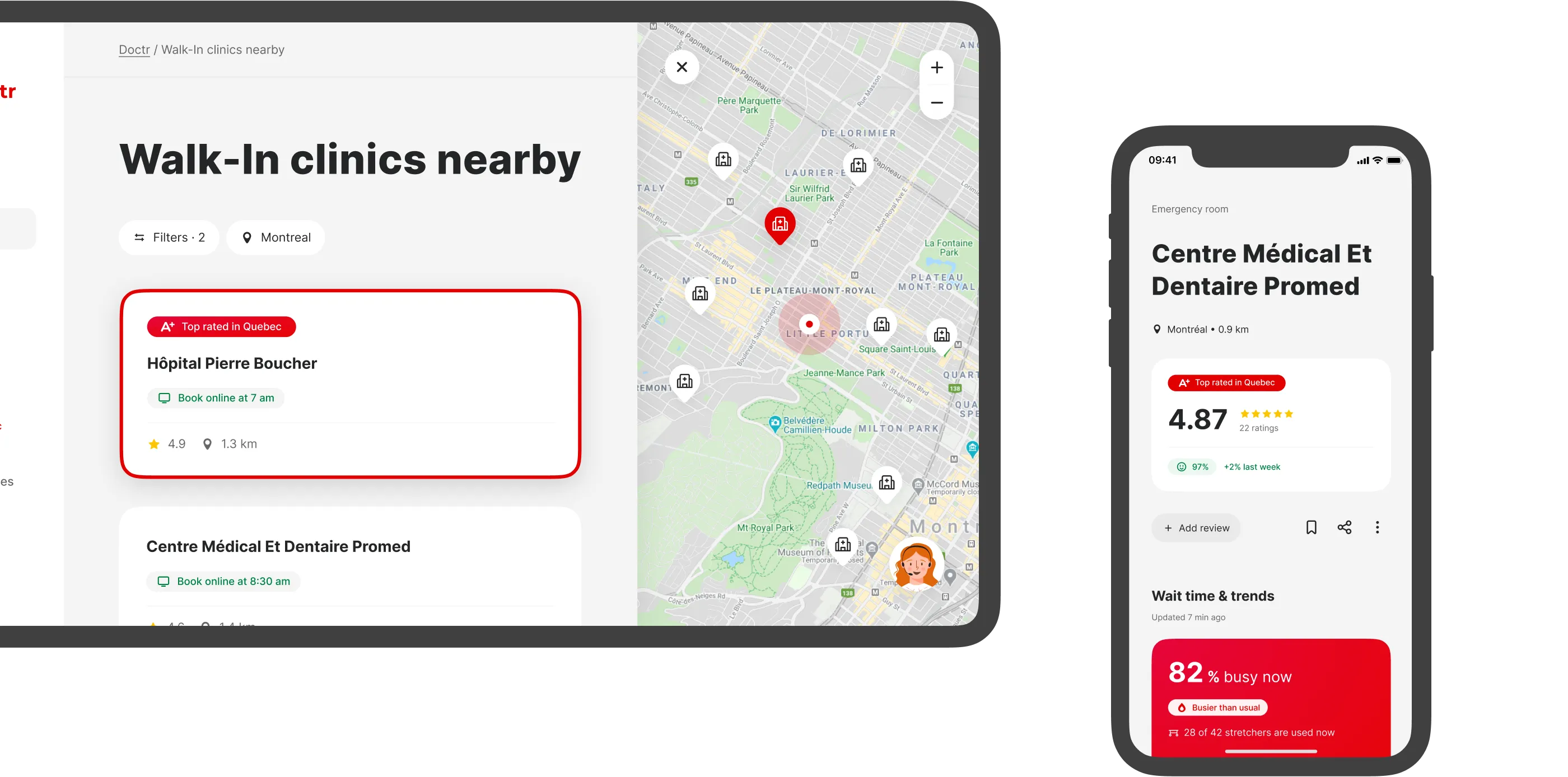
Explore
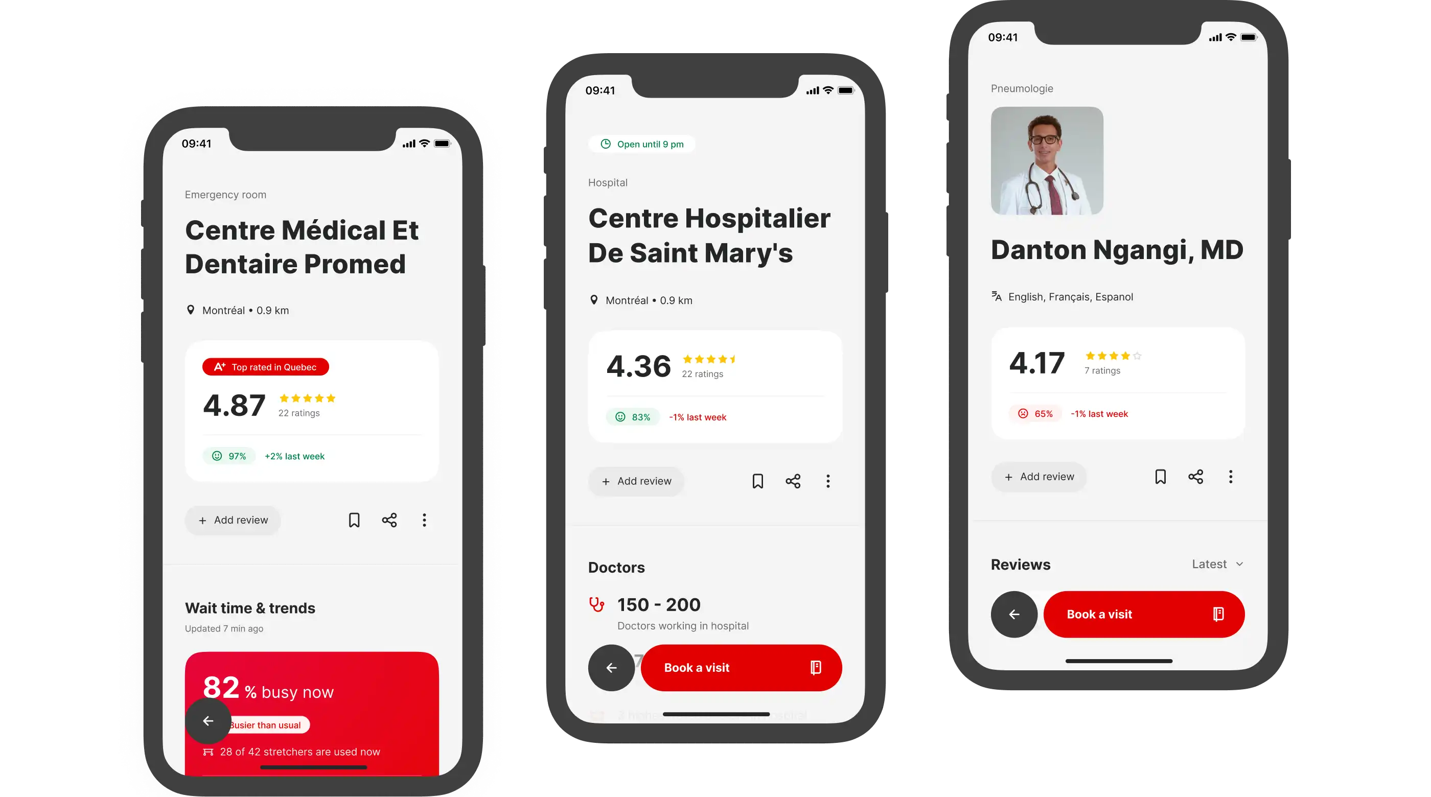
From the tab bar we get to the Explore section, which contains the entire catalog of services, doctors, clinics, emergency rooms.
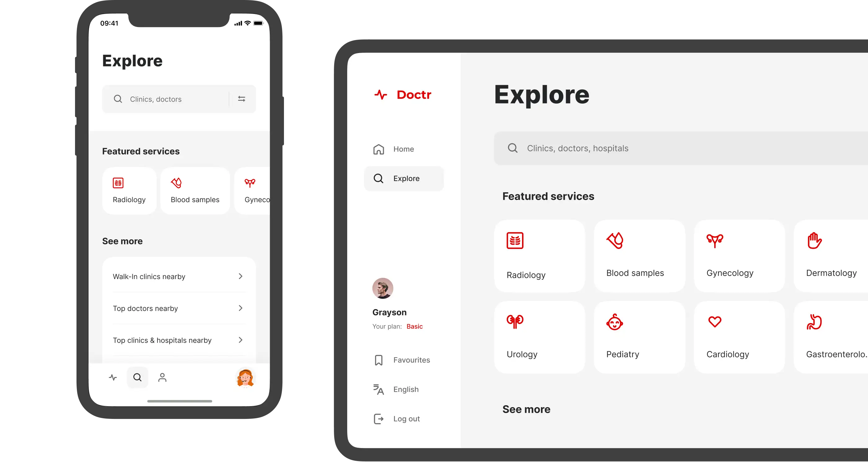
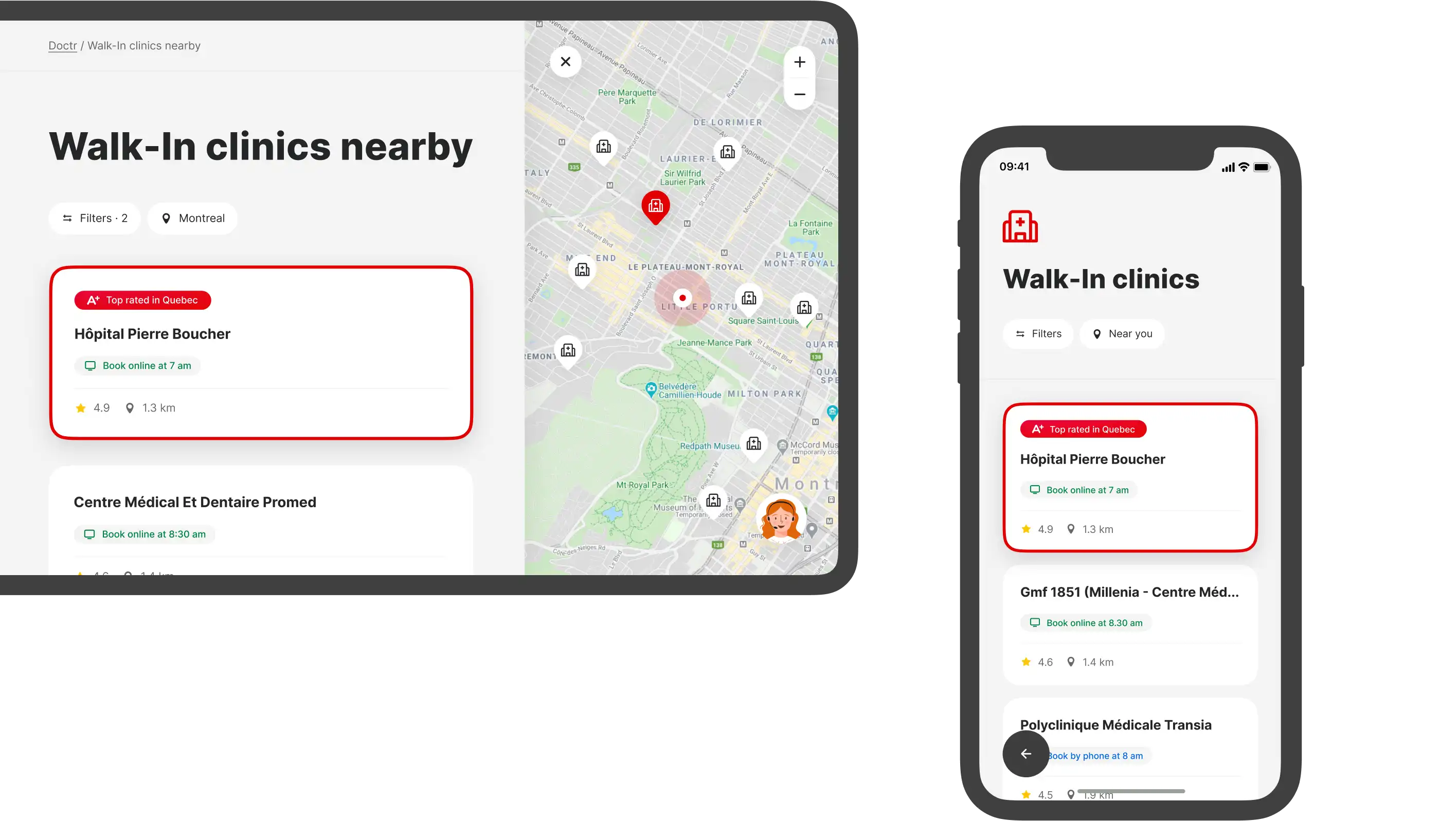
Our user knows where he needs to go. For this type of user, we have provided a list that he can filter and select a location on the map. The first place in the list is always taken by the clinic that received the best results in patient surveys.

Profiles
From the tab bar we get to the Explore section, which contains the entire catalog of services, doctors, clinics, emergency rooms.
07
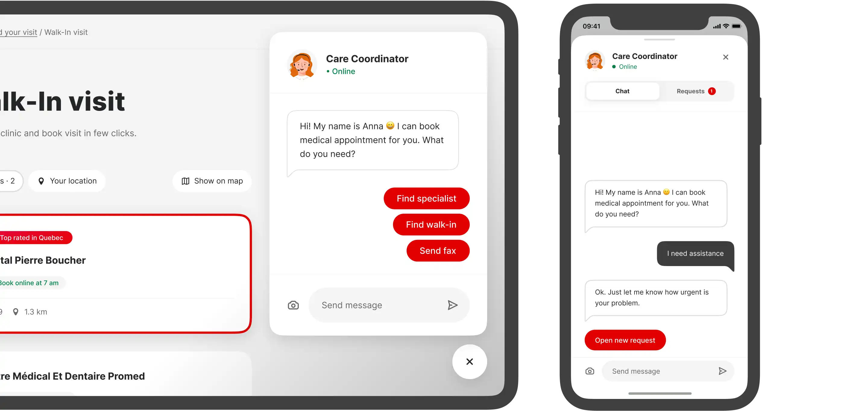
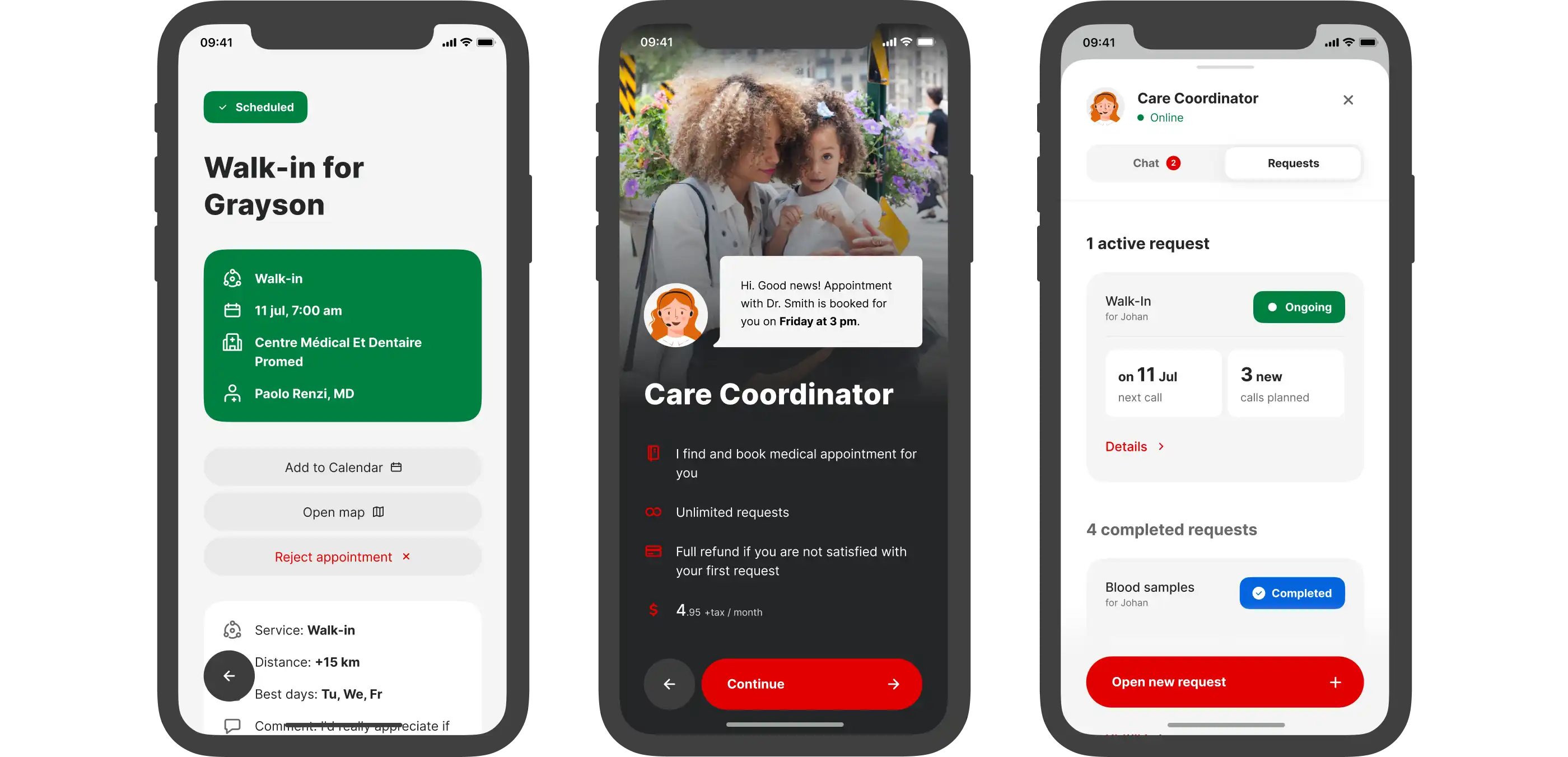
Care Coordinator
This is the first point of contact for all your appointments. Our unique tool for simplified access to the healthcare system.
08
What I’ve learned
Designers can be more than just designers
Going from ideas to launching a product to market takes a lot more than the usual work of a designer. This includes works on with naming, branding, marketing, recruitment, business decisions and more.
Speed is more important than quality sometimes
It’s tempting to develop more features and come up with solutions to untested problems. But it is very important to release the first version of your product as soon as possible in order to understand your users needs.
Ego is your enemy
We had a perfect relationship with the CEO and were able to make all decisions based on the product.
